Nimbus
UX Design Case Study
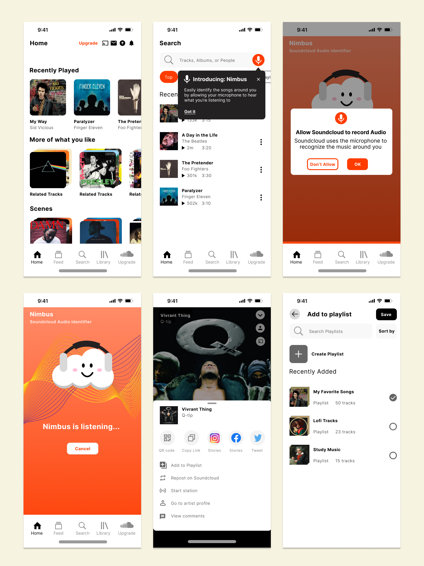
Nimbus is a proposed new feature that allows users to identify music with their device’s microphone and generates results from Soundcloud’s data base.
Overview
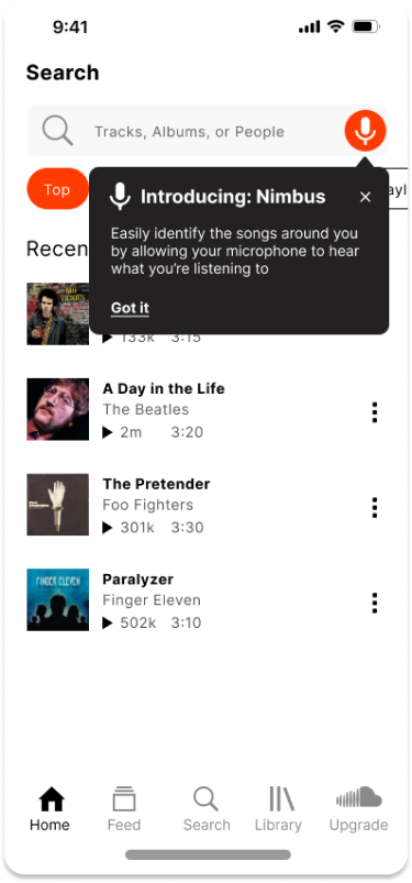
My plan was to improve the user experience by implementing the new feature within the Search page, adding a tooltip introduction to hook users, and incorporating aesthetic UI to complement the smooth experience.
Problem
I proposed this new feature because there are unique and original tracks within Soundcloud that cannot be found with popular apps like Shazam and are left undiscovered.
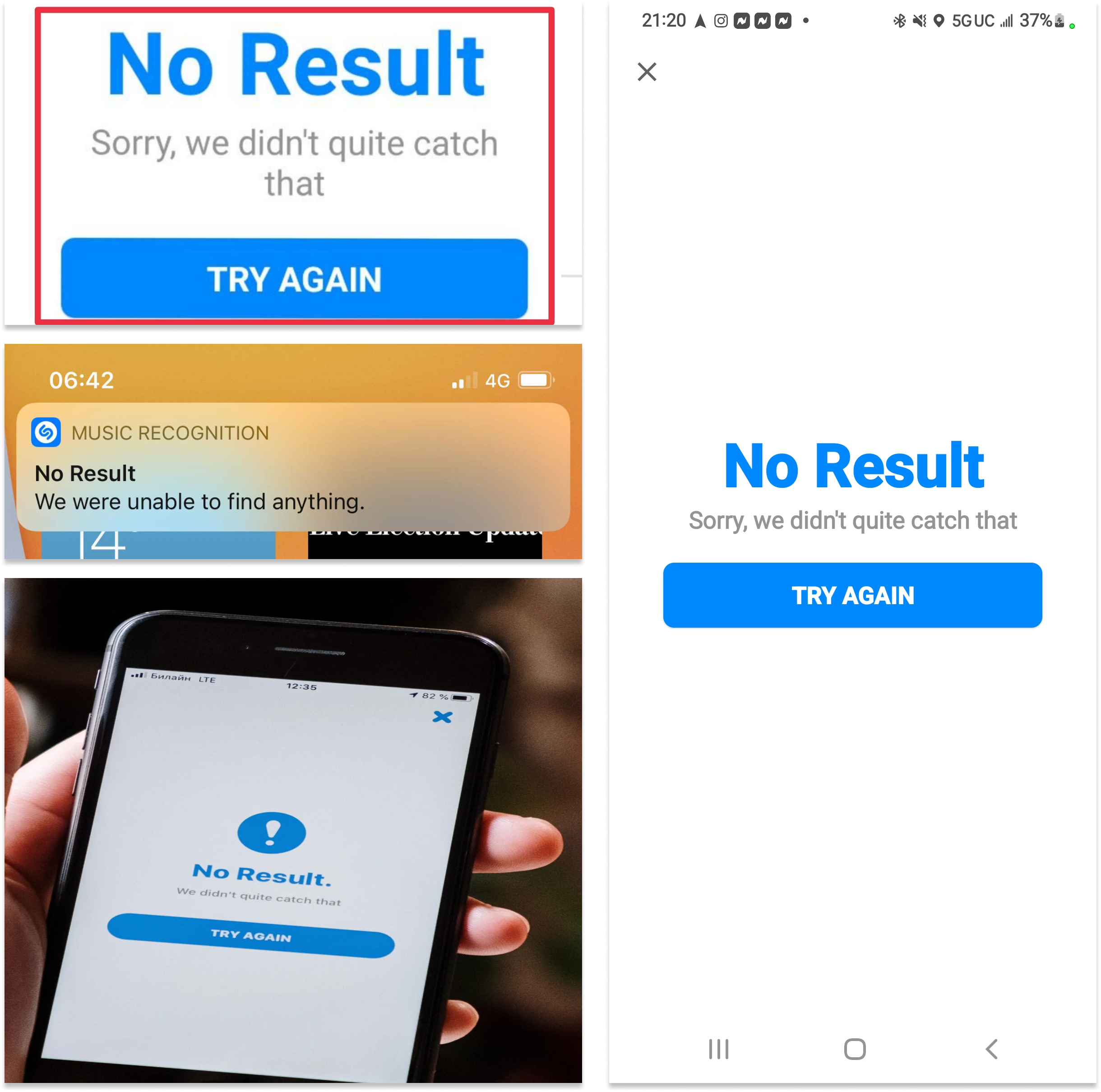
Shazam cannot identify
Original Music from new artists
Remixes and edits
Any sounds outside of its database
User Interviews
10 participants
Ages 18 - 26
Short answer format
I wanted to learn about users’ wants, needs, and experiences when it came to the Soundcloud.
What is your relationship and needs with Soundcloud?
What are the good things you like about the Soundcloud?
What are your frustrations with the Soundcloud?
What has your experience been like?
"I wish there was another way I could find this remix of this song”
— Anonymous
From these user interviews and persona, we can draw upon the following insights:
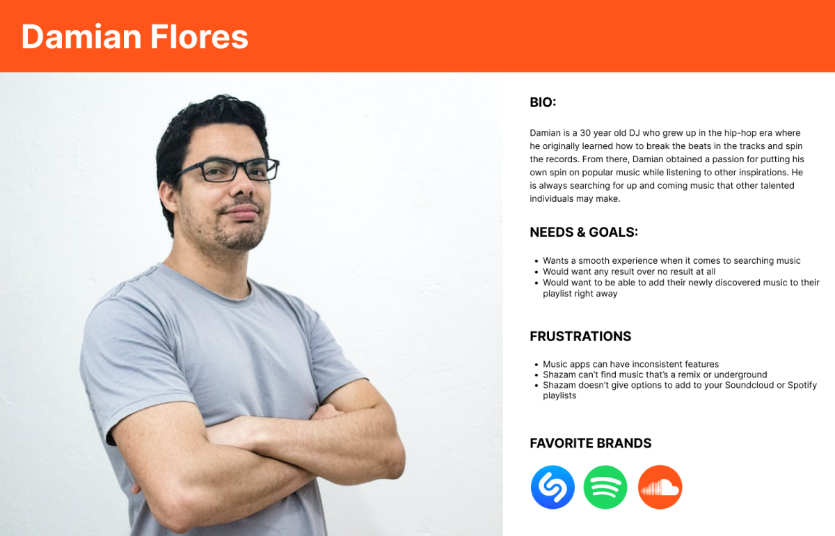
Young music lovers find themselves frustrated when they can't find out a song they just discovered
Young music lovers feel frustrated when there's no additional clues towards finding out a song they like
Young music lovers feel friction as the process of exiting a music discovery app to manually add their song in another app can be tedious.
Solution
Based on our data, we can create the following user and business goals.
User Goals
Identify unknown songs that we want
Be given clues if it’s not a good match
Seamless addition to our playlists
Business Goals
Increase the conversion rate
Improving brand reputation
Increase awareness of services offered
My plan to accomplish these goals is by
Implementing this feature within the Search page
Adding a tooltip introduction to hook users
Incorporating good UI to complement the smooth experience
Enhancing Visual Flow
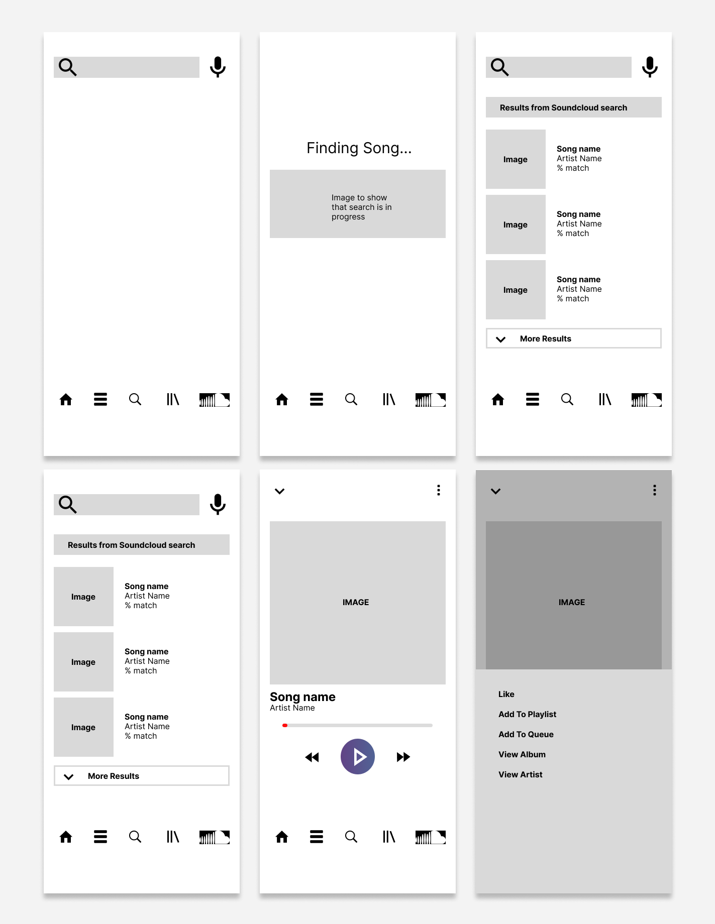
I created a user flow to ensure key features were included. I then produced wireframes that focused on introducing new users to a mic function on the search page and letting them add the new song to their playlist.
Usability Testing
5 participants
Ages 18 - 26
Rating score format
I conducted a usability test regarding user flows across 5 participants via to test and gauge the look and feel of the new design
I measured success with:
How easy to find and use the feature
How fast users understand what the feature does
How does the feature integrate visually
All 5 participants gave the following:
5/5 rating — Ease of Use
5/5 rating — Understanding
4/5 rating — Visual integration
Iterations
I made several iterations in my design and decided to implement a tooltip, additional filter buttons, and a match percentage in the results reaction to best accommodate to user needs and goals
The mic feature wasn’t completely effective in hooking users therefore I decided to implement a Tooltip that pops up for the first time the search page is opened. Therefore, the user will be introduced to the feature as soon as possible and will be more likely to understand what it’s for and encourage further use.
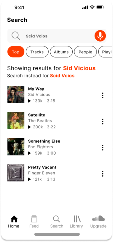
Here I decided to add filter buttons and a Search Correction feature because users often complained how the search experience was clunky and results were too literal with little error forgiveness. These added changes would help improve the user search experience while minimizing how many clicks it takes to filter or fix errors otherwise.
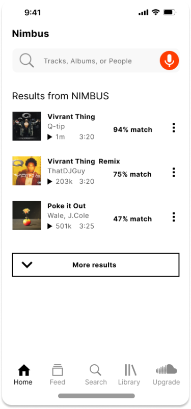
I decided to add a percentage match indicator alongside each result. That way, results are more flexible when it comes to possible errors from Nimbus. Users will have some form of result rather than no result and will have a clue in terms of what they’re searching for otherwise.
Takeaways
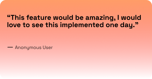
I showed my design to some users and they were very impressed! They agree that my design addresses many of the user pain points, however further testing and research should be done to see how truly effective they are.
I’m confident that this re-design would have accomplished all of the user and business goals that I set in the beginning. Not only visually, but functionally, the content is readily accessible, and intuitive. This new feature and iterations would have improved conversion rate, awareness, and brand reputation.
I’m most proud of the flow and experience I drafted up. I learned about the nuances of teaching new users about new features. Next time I would create more iterations of the Nimbus art and its various animations when searching for music.
