Empowered Therapy
UX Case Study
Empowered Therapy is a online therapy mobile app that focuses on empowering users to be able to choose which therapists they want.
Overview
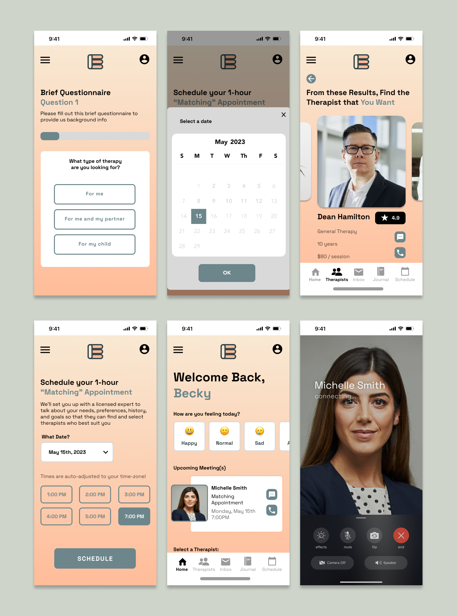
My plan was to improve the user experience by shortening questionnaires to easy questions, allowing users to select their own therapists, granting 3 free trial sessions before paying and introducing a “Matching” Appointment, where the user will meet with a licensed expert to discuss needs, preferences, history, and goals, so they can find the best therapists suited for the user to choose from.
Problem
I wanted to design this app so that users can access online but intimate therapy sessions that may be harder to attend and schedule physically or financially. Patients care about their well-being and prefer convenient medical consultations via mobile apps
Finding the right therapist is difficult
Questionnaires feel too long
Paying before even meeting an assigned therapist
User Interviews
10 participants
Ages 18 - 28
Short answer format
I wanted to learn about users’ wants, needs, and experiences when it came to the therapy.
What is your relationship and needs with Therapy?
What are the good things you like about the Therapy?
What are your frustrations with the Therapy?
What has your experience been like?
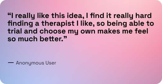
"It’s anxiety-inducing. What if I just don’t like my therapist and we don’t connect? ”
— Anonymous
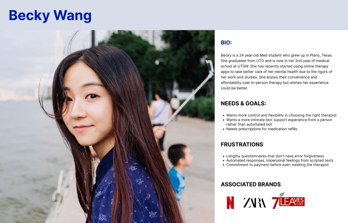
From these user interviews and persona, we can draw upon the following insights:
Stressed students feel limited when it comes to finding a therapist they like.
Stressed students feel friction and tediousness when onboarding questionnaires are too lengthy.
Stressed students feel uncertainty and unwanted pressure when they feel forced to pay before meeting their online therapist.
Solution
Based on our data, we can create the following user and business goals.
User Goals
Better ways to find a therapist they like
Shorter onboarding so it’s quick and easy
Reduced commitment of payments before even meeting the therapist
Business Goals
Increase the conversion rate
Improving brand reputation
Encourage longevity of user loyalty
My plan to accomplish these goals is by
Shortening Questionnaires to easy and basic questions
Allowing users to select their own therapists and free trial sessions before paying
Introducing a “Matching” Appointment, where the user will meet with a licensed expert to discuss needs, preferences, history, and goals
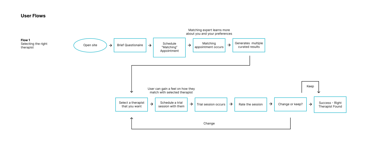
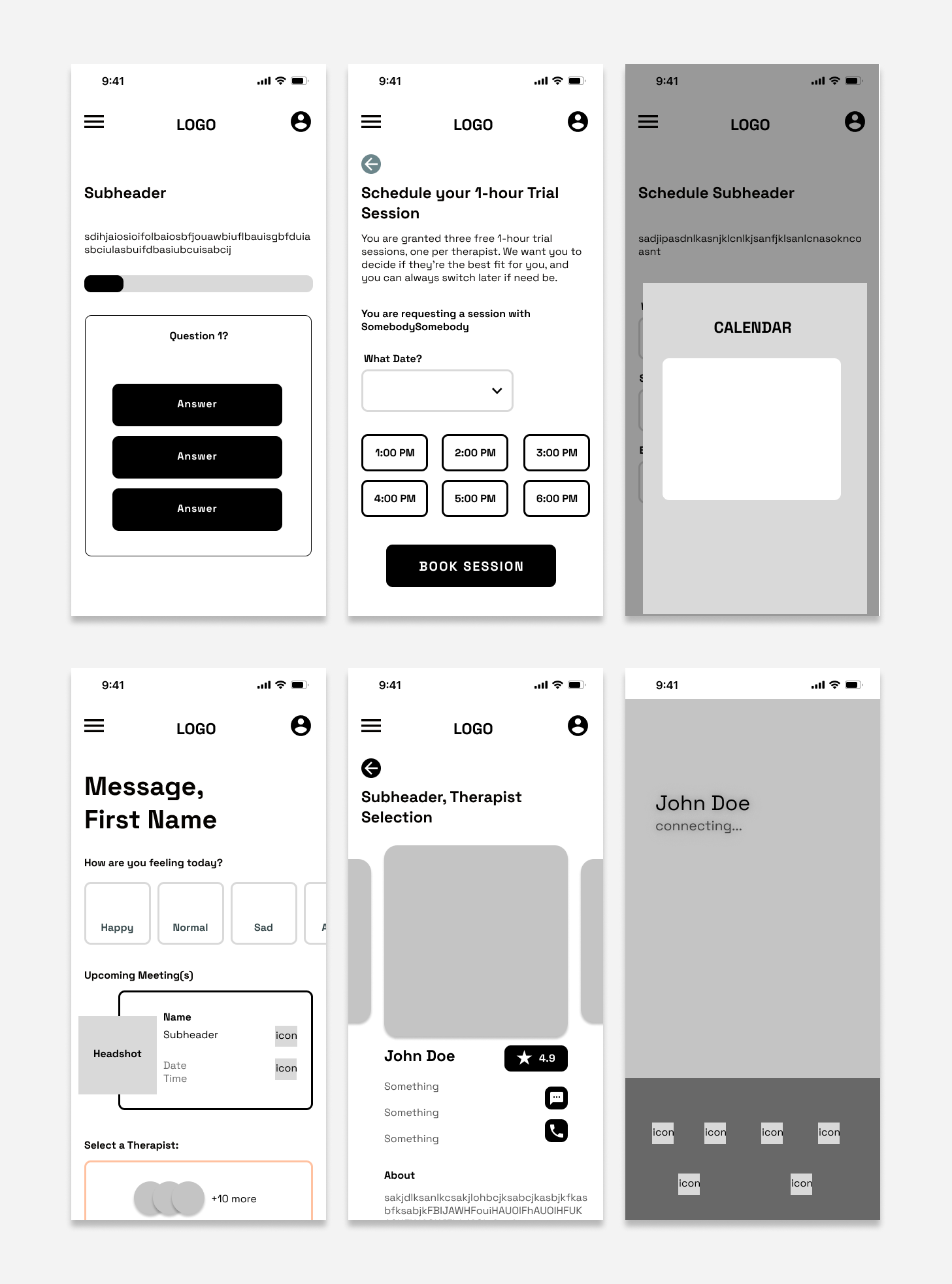
I created a user flow to ensure key features were included. I then produced wireframes that focused on introducing the “Matching” Appointment” feature and emphasizing therapist selection for the user.
Enhancing Visual Flow
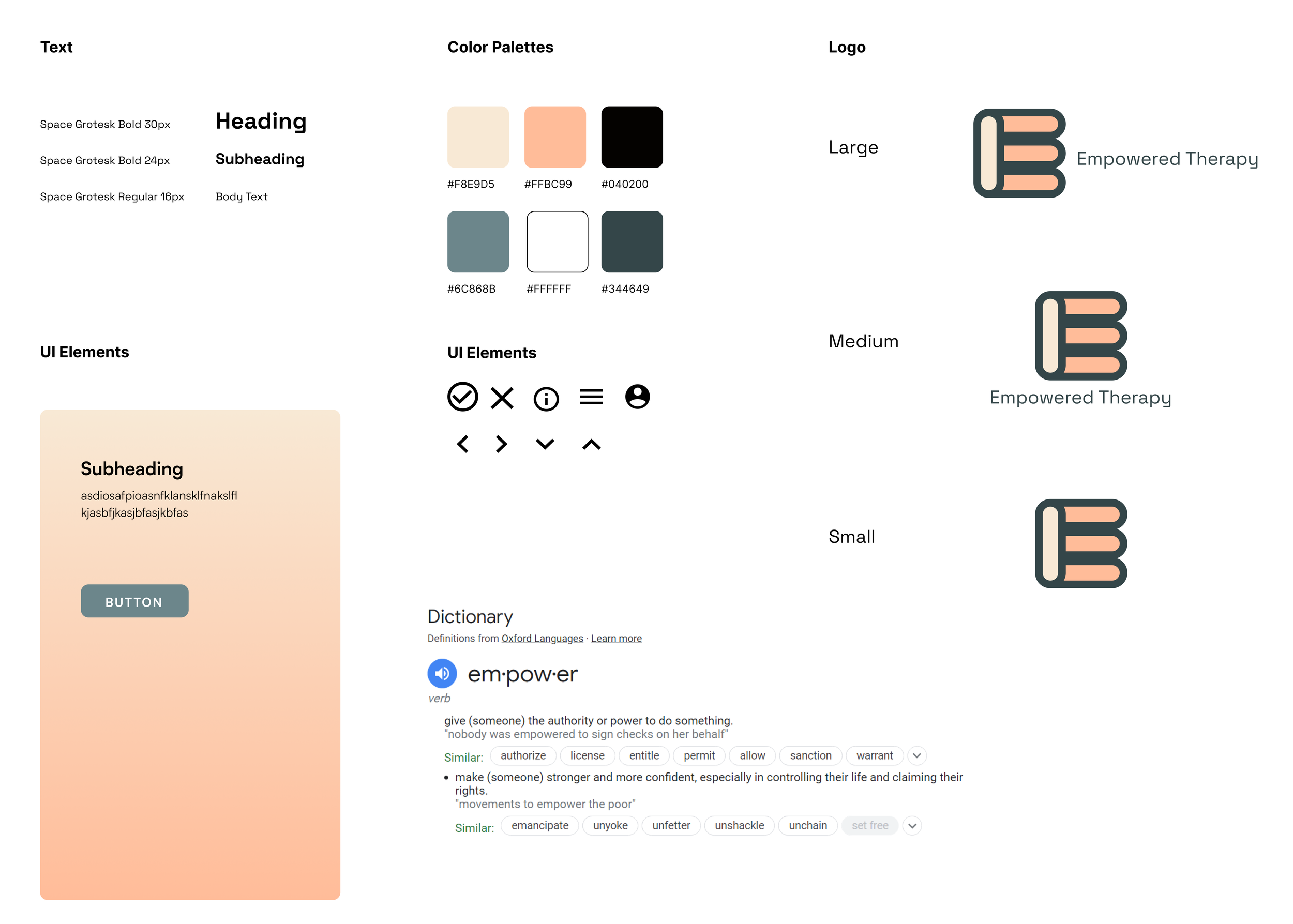
I derived the name Empowered Therapy, going off of the unique selling point that users are claiming control back and should be able to choose who they would want to bare their soul to in therapy.
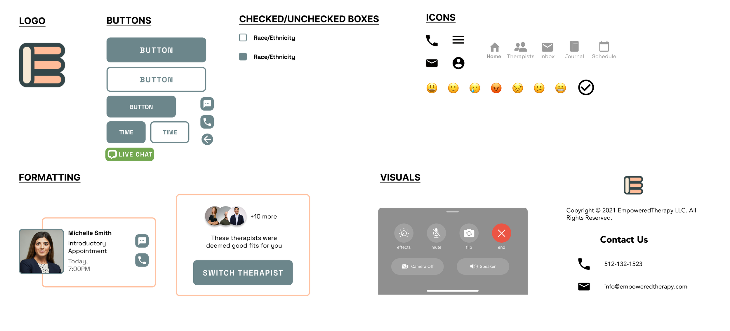
I chose more "sunset" type colors to give a more calming feeling and the font chosen is very modern, friendly, and approachable.
Style Tile
Usability Testing
5 participants
Ages 18 - 28
Rating score format
I conducted a usability test regarding user flows across 5 participants via to test and gauge the look and feel of the new design
I measured success with:
How easy it is to navigate and complete the user flow
How fast do users understand what the app does and how it works
How do the visual elements integrate and appeal to users
All 5 participants gave the following:
4/5 rating — Ease of Use
5/5 rating — Understanding
5/5 rating — Visual integration
I made several iterations in my design and decided to implement a step-by-step graphic, tooltip, and time buttons to best accommodate user needs and goals.
Iterations
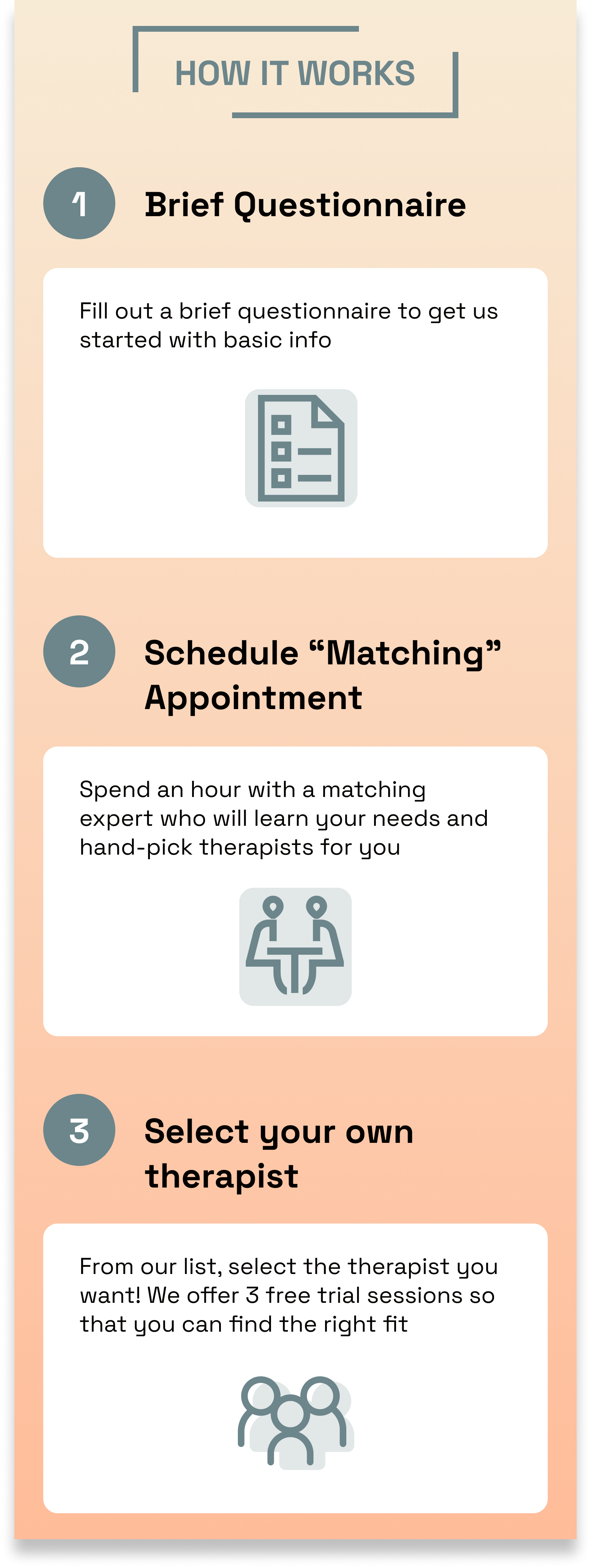
A new process means it can be unfamiliar to new users. After some feedback, I decided to include this “How it works” graphic to convey to users how the app works and what step they’re currently on.
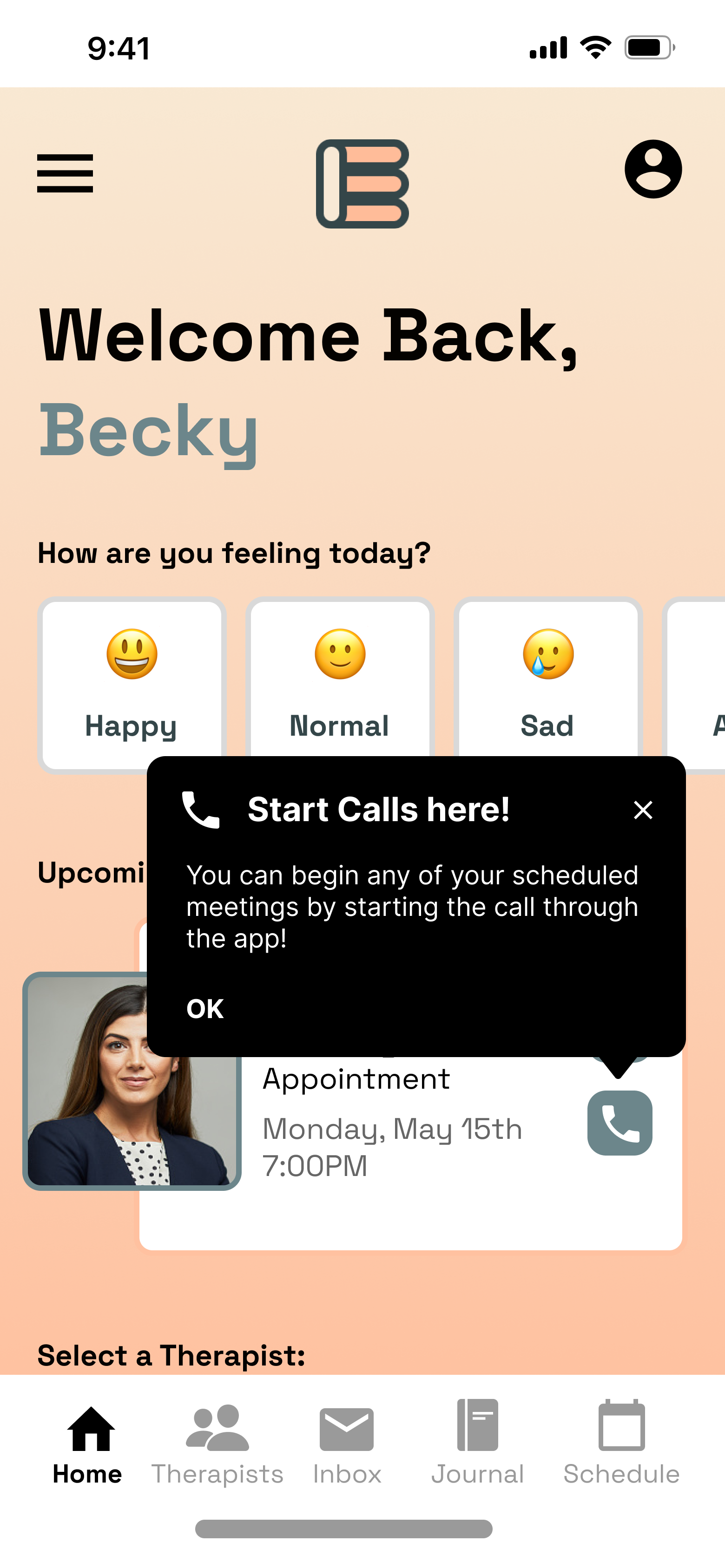
The tradeoff of using the universal call and text buttons was that it wasn’t quite clear whether you were using your number, facetime, or the app. To reduce clutter by using reminder taglines but still be informative to new users, I included a tooltip to teach users that the Call button is how meetings start and are held through the app.
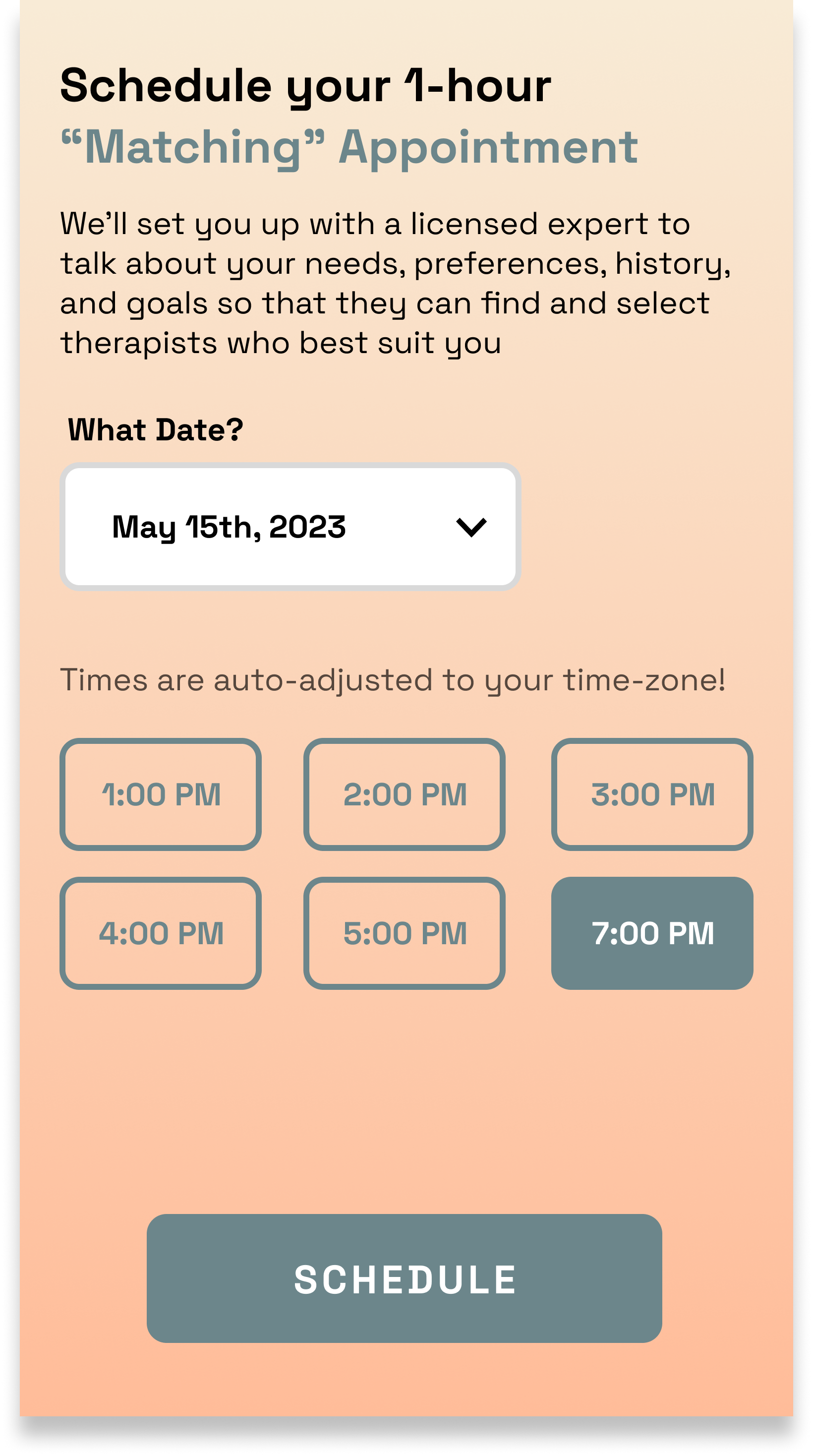
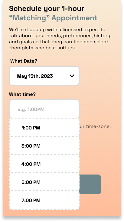
I decided to revamp my original scheduling UX due to the nature of how date and time would be limited by the therapist themselves. Therefore it made sense to reduce the number of clicks by displaying time buttons rather than a drop down filter. This would better convey to the user how many limited options there are.
Takeaways
I showed my design to some users and they were very impressed! They agree that my design addresses many of the user pain points, however further testing and research should be done to see how truly effective they are.
I’m confident that this app idea would have accomplished all of the user and business goals that I set in the beginning. Not only visually, but functionally, the flows and experience are new, yet familiar, and intuitive. I do believe that compared to current apps, this MVP would have a higher conversion rate, awareness, and brand reputation.
I’m most proud of the flow and experience I drafted up. I learned about the nuances of therapy pain points from interviewing my users. I’m also proud of the slot booking button feature because I learned about the nuances of the appointment booking experience. Next time I would explore into various other colorways to see what vibe and feeling is the most appropriate.
