Foundation Dance Studio
UX Case Study
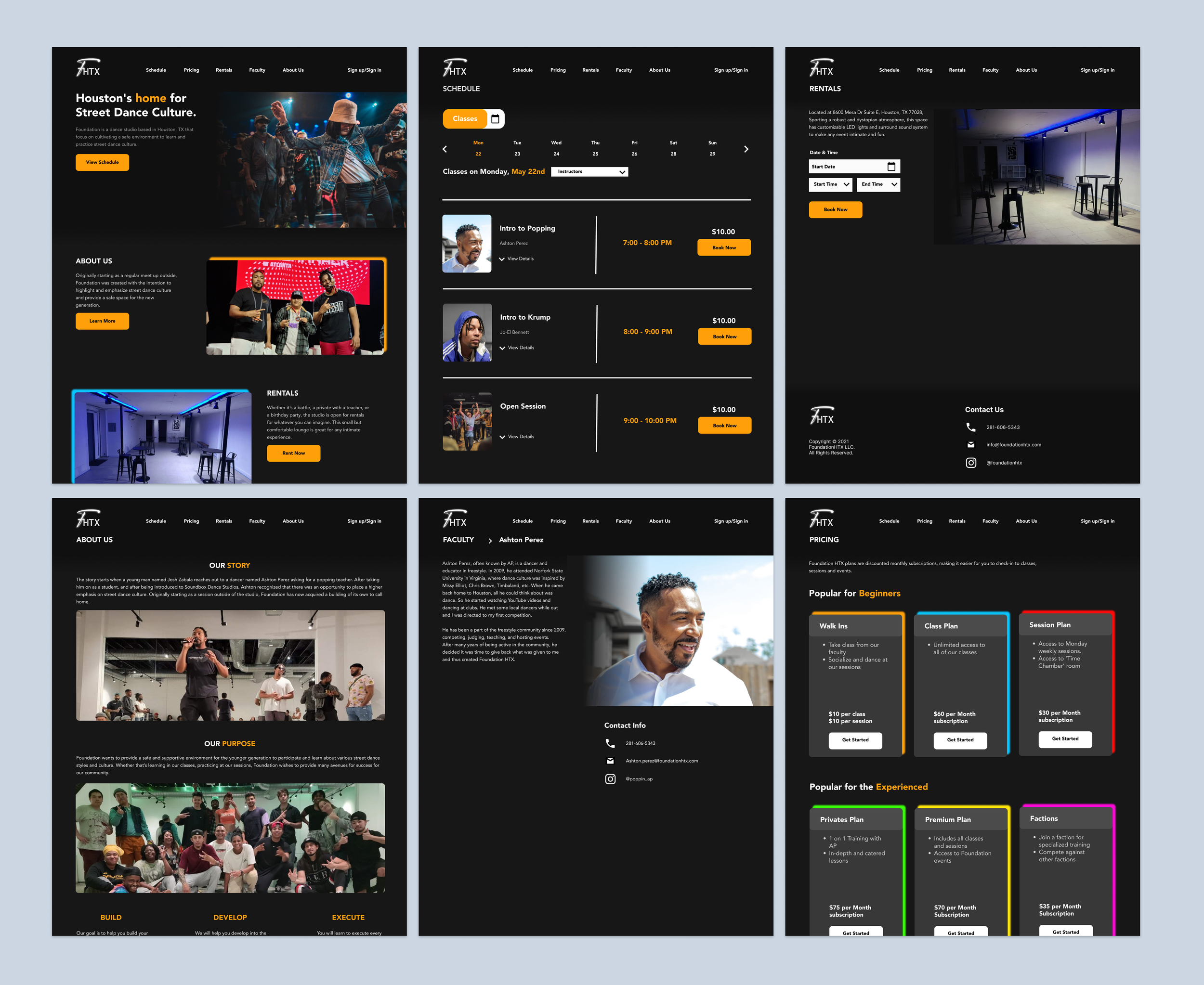
Foundation is a dance studio based in Houston, Texas, rooted in authentic street-style culture. The client wanted to redesign the digital and responsive experience of Foundation Dance studio
Overview
My plan was to improve the user experience by honing in on the Schedule CTA, restructuring the visual hierarchy, and highlighting services offered. This would better inform users about what the studio can do and make booking smoother.
Problem
I conducted a heuristic evaluation and user interviews and learned about several painpoints:
Missing key functions and features
Unable to cancel memberships
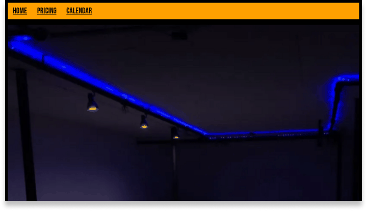
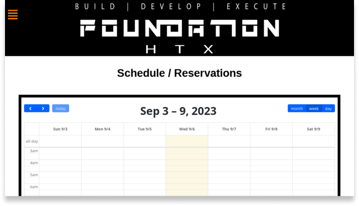
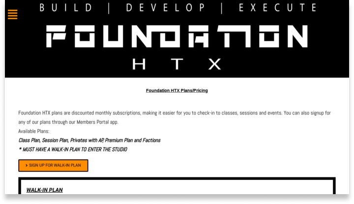
Out-dated and inconsistent design
Lack of clarity of what the business offers
User Interviews
10 participants
Ages 18 - 30
Short answer format
I wanted to learn about users’ wants, needs, and experiences when it came to the studio.
What is your relationship and needs with dance?
What are the good things you like about the studio?
What are your frustrations with the studio?
What has your experience been like?
"I wish the studio’s information was presented in a more clear and concise fashion”
— Anonymous
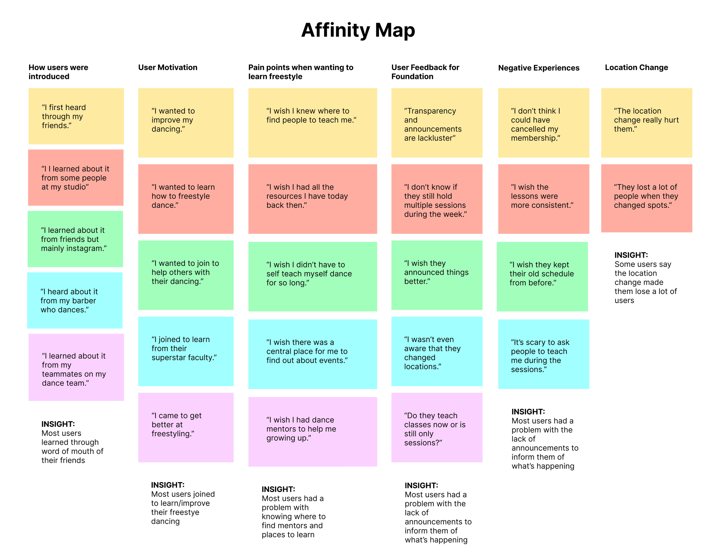
From these user interviews and affinity map, we can draw upon the following insights:
Dancers are uninformed about what the studio offers
Dancers are uninformed about when events occur
Dancers are uninformed about where to find quality mentors and teachers
Solution
Based on our data, we can create the following user and business goals.
User Goals
Have a smoother experience
Be more well-informed
Learn how to dance
Business Goals
Increase the conversion rate
Improving brand reputation
Increase awareness of services offered
My plan to accomplish these goals is by
Honing in on the Schedule CTA
Restructuring the visual hierarchy
Create dedicated pages to highlighting services offered
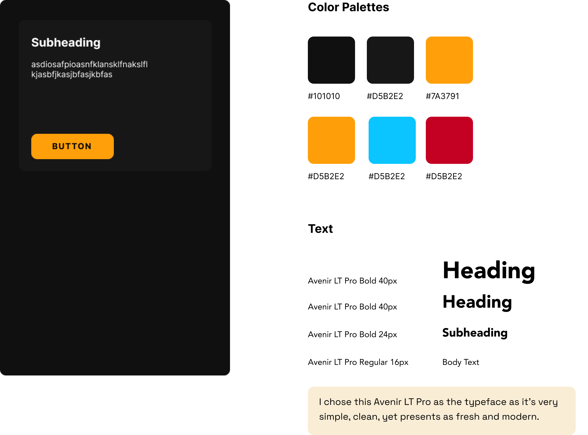
Style Tile
Despite being a dance studio, I wanted to push for a dark design to capture the raw and street-style atmosphere of the dance battles and culture.
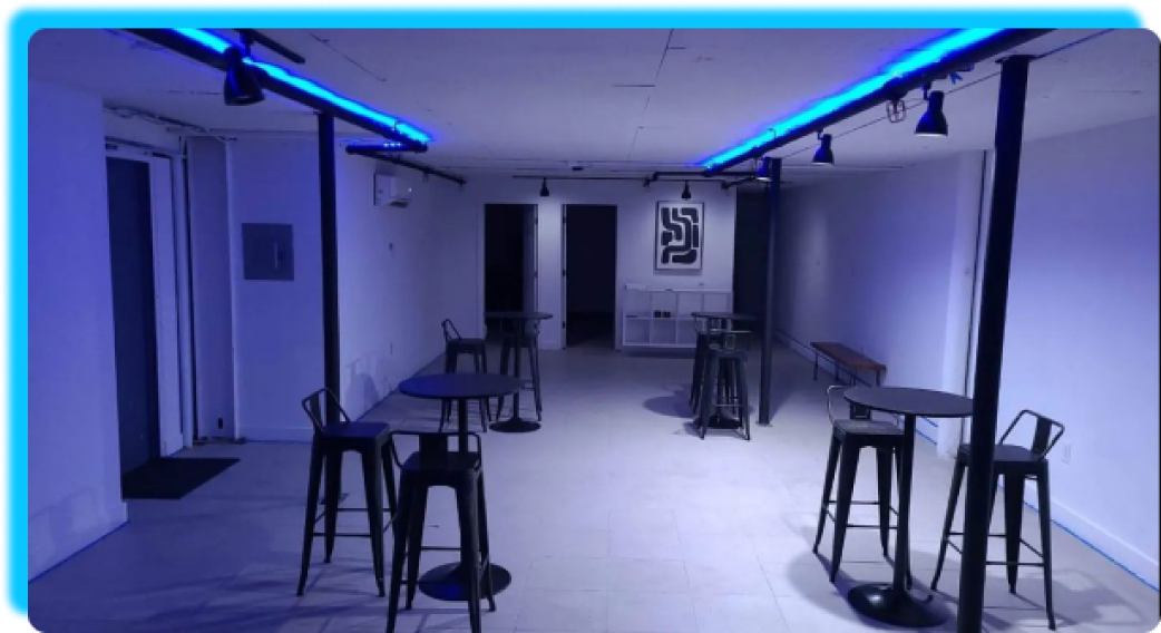
To give the dark design more life, I added vibrant neon accent colors, inspired by lighting at the actual studio..
Improving Visual Hierarchy
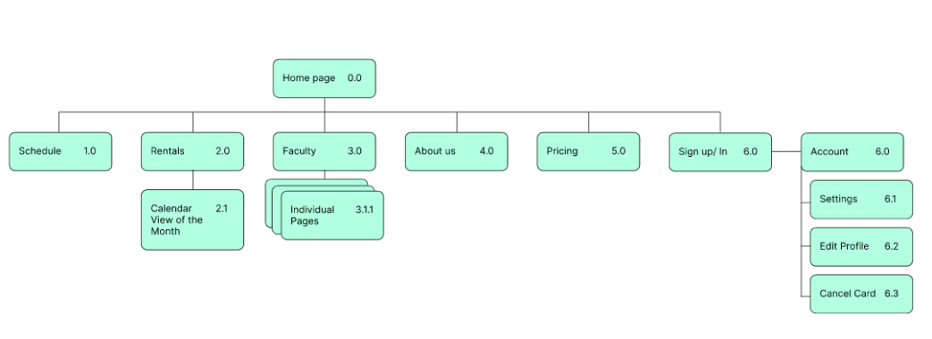
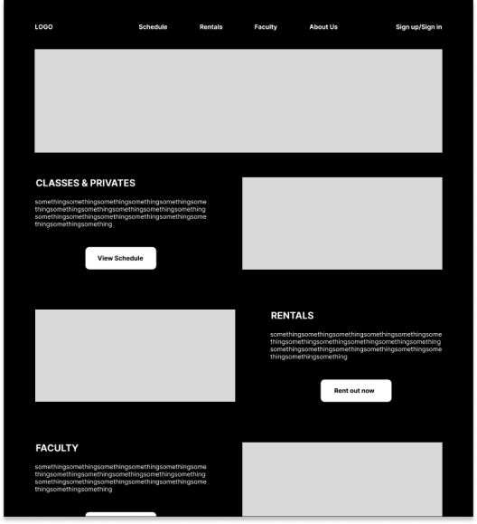
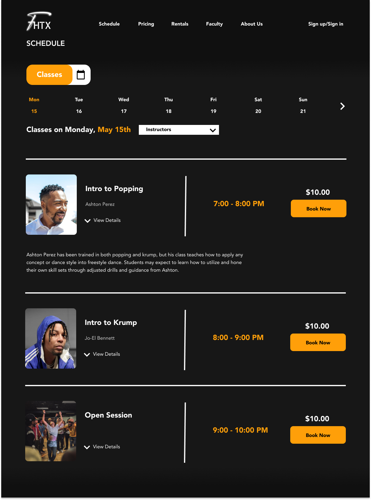
I created a site map to ensure key pages and features were included. I then produced wireframes that focused on an improved visual hierarchy for services offered and the schedule feature
Usability Testing
5 participants
Ages 18 - 30
Rating score format
I conducted a usability test regarding user flows across 5 participants via to test and gauge the look and feel of the new design
I measured success with:
Ease of navigation
Minimal Errors
Ask user to rate how intuitive/ the navigation is
Unexpected flow vs Expected flow
All 5 participants gave the following:
5/5 rating Ease of Navigation
0 errors Minimal Errors
5/5 rating Intuitive navigation
4/5 rating Unexpected/Expected flow
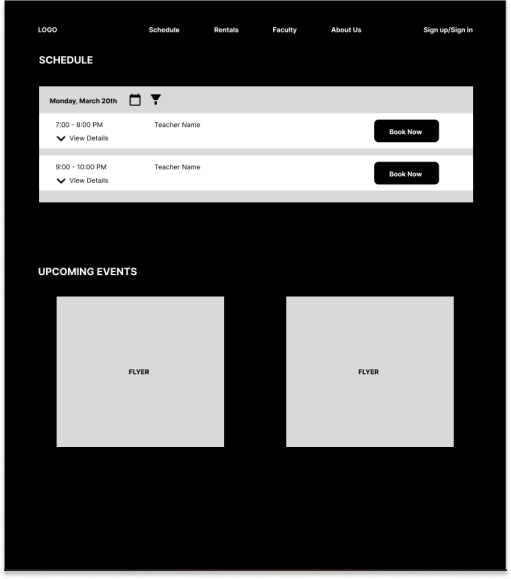
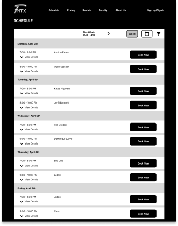
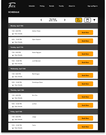
Schedule Iterations
The schedule page was the most difficult as there are many different takes on a schedule/booking feature.
After many iterations, I decided to focus more on white space to give a more spacious feel while still providing functions to allow users to sift to specific dates
Takeaways
I showed my client the redesign and he was impressed. As of right now, the design has not been implemented yet due to constraints in time and budget in the actual building of the website, but hopefully soon!
I’m confident that this re-design would have accomplished all of the user and business goals that I set in the beginning. Not only visually, but functionally, the content is readily accessible, and intuitive. Compared to the old design, this would have improved conversion rate, awareness, and brand reputation.
I’m most proud of how better and lively it looks compared to my original drafts. I learned about the nuances of good dark design and class booking experience. Next time I would dive into more iterations of the schedule page.
