Evenground Dance Studio
UX Design Case Study
Evenground is a new dance studio, local business, and passion project that I helped start up with my friends in our hometown. The studio offers a wide range of dance classes suitable for all experience levels.
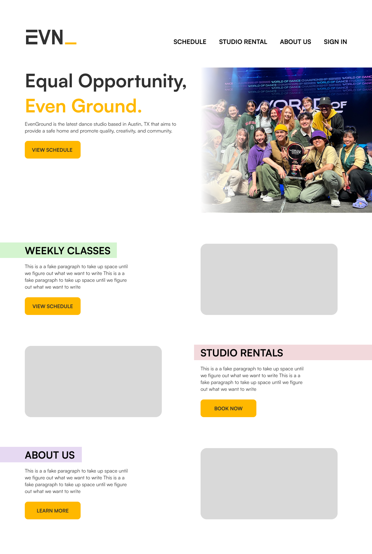
Evenground website home page
Overview
My plan was to improve the user experience and increase the conversion rate by highlighting the CTA, highlighting the services offered on the home page, and including images and graphics for visual context and social proof of credibility.
Problem
As a new local business competing in a niche market, the challenge was to
Inform users of our existence and services
Produce a smooth user experience to keep clientele
Create something that resonates with young people
User Interviews
10 participants
Ages 15 - 28
Short answer format
I wanted to learn about users’ wants, needs, and experiences when it came to the studio.
What is your relationship and needs with dance?
What are the good things you like about studios?
What are your frustrations with the studios?
What has your experience been like?
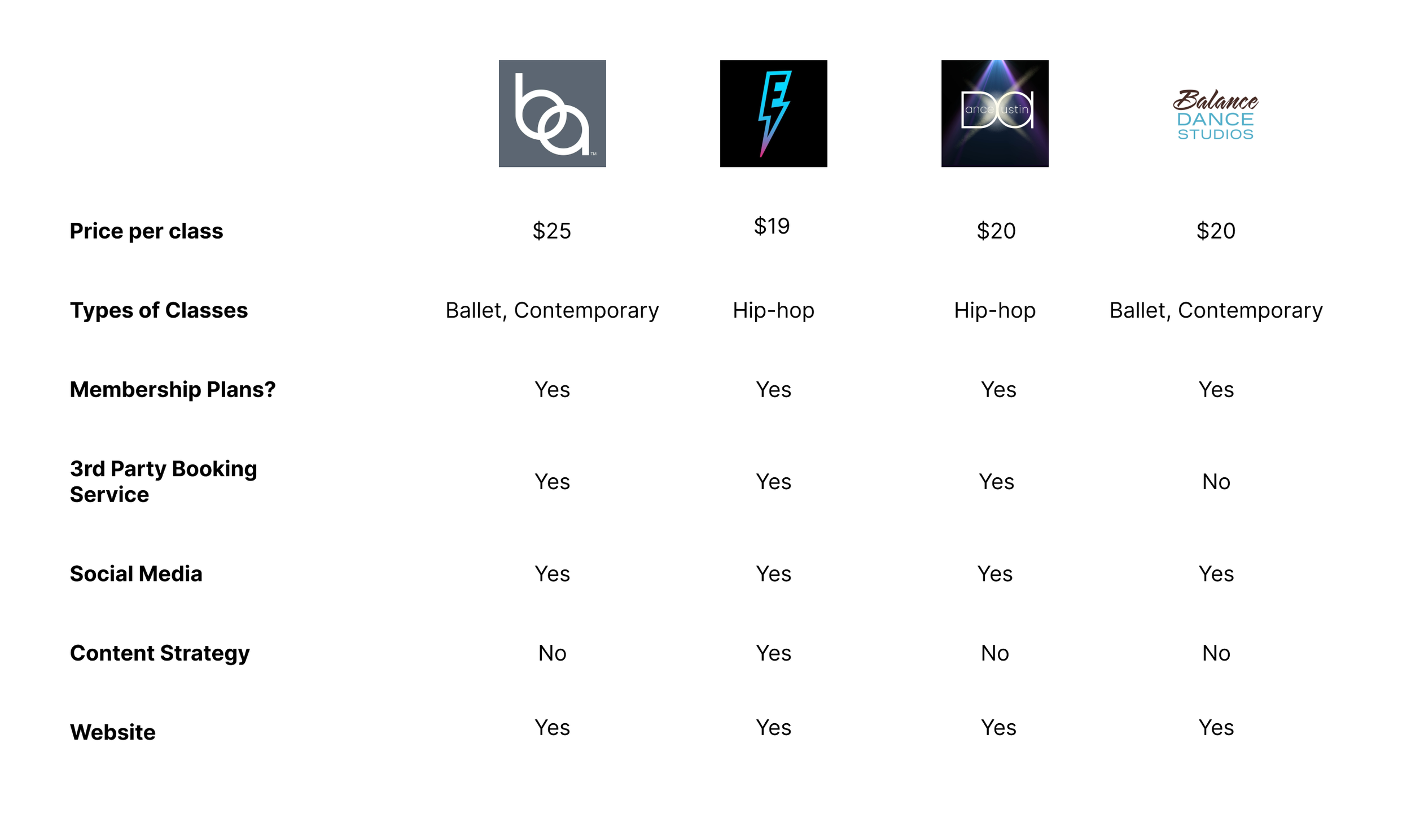
Local Austin Dance Studios Competitor analysis
"I really wish dance websites were straight forward and not so jam packed”
— Anonymous
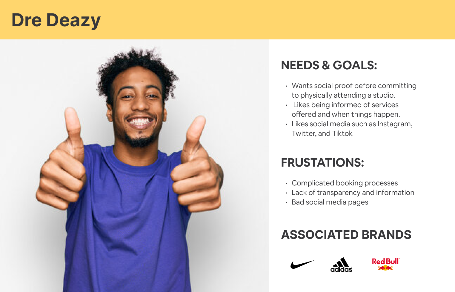
Young adult dancer persona
From these user interviews and persona, we can draw upon the following insights:
Young adults like being informed of services offered and when things happen.
Young adults enjoy smooth and frictionless processes to set up appointments
Young adults enjoy using social media such as Tiktok or Instagram due to shareability, and networking, which resonates with them.
Solution
Based on our data, we can create the following user and business goals.
User Goals
Have a smooth and enjoyable user experience
Be able to quickly learn important information
Be able to engage on social media
Business Goals
Increase the conversion rate
Increasing visibility and exposure
Encourage longevity of user loyalty
My plan to accomplish these goals is by
Integrate a dedicated 3rd party booking service due to limitations of Squarespace
Provide all important information and services concisely on the home page
Utilize graphics to maintain a good visual hierarchy, grouping, alignment, etc.
Add Instagram buttons and links that lead users to our social media page
Creating Sitemap and Drafts
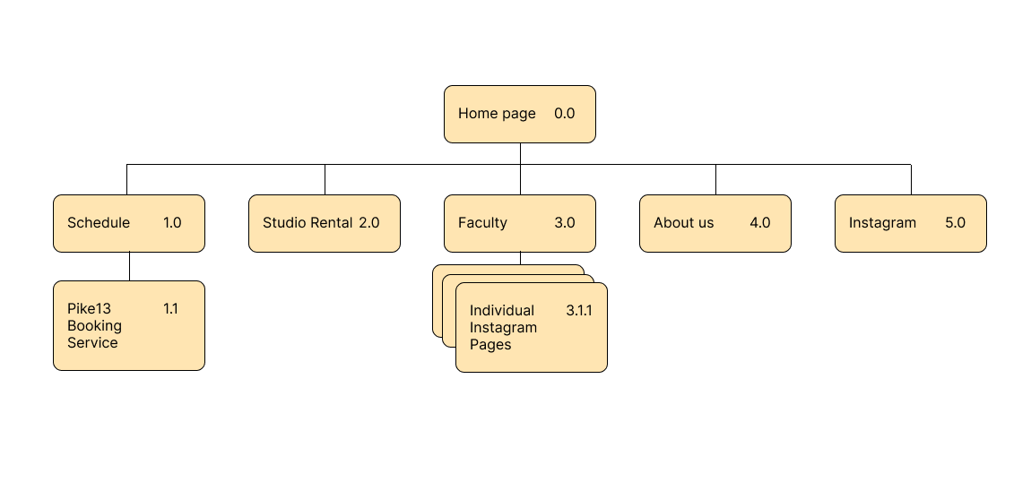
I created a site map to ensure key features were included. I then produced high-fidelity wireframes that focused on highlighting what the studio is and what we offer. While our website serves to inform, our CTA buttons would lead to Pike13, a 3rd scheduling service that has a smoother booking experience than if it was built through Squarespace.
Evenground Sitemap
Evenground High-Fidelity Wireframes
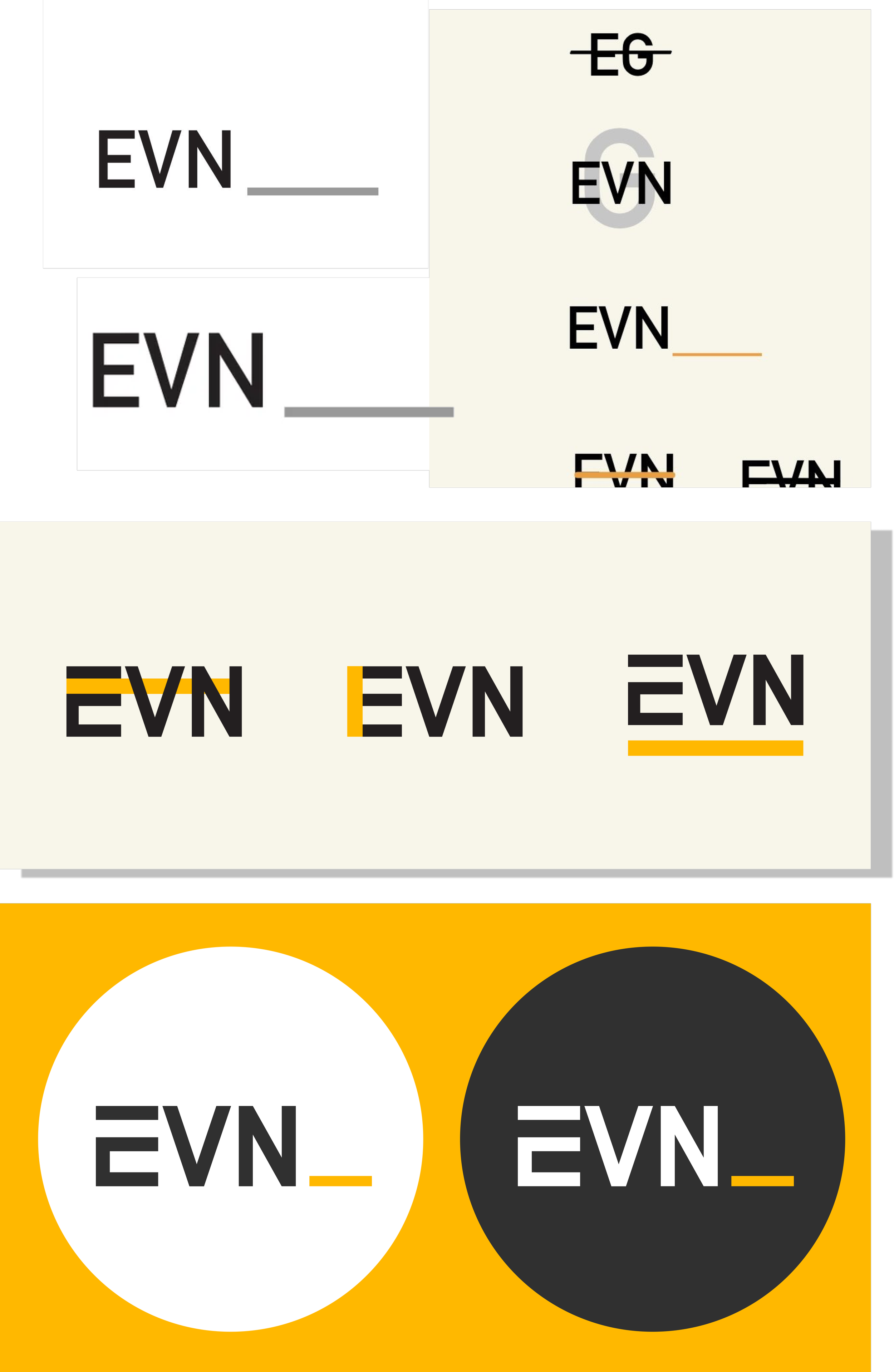
Logo Ideation
My friend came up with the name Evenground, which gave me a creative constraint to work with.
I ended up going with a minimalistic logo style and revolved ideation around straight lines that could represent the “ground.”
Evenground Logo Evolution
Usability Testing
I conducted a usability test regarding the booking flow across 5 participants
I measured success with:
How easy it is to navigate and complete the CTA
How fast do users understand what the app does and how it works
How do the visual elements integrate and appeal to users
5 participants
Ages 18 - 28
Rating score format
All 5 participants gave the following:
5/5 rating — Ease of Use
5/5 rating — Understanding
4/5 rating — Visual integration
Iterations
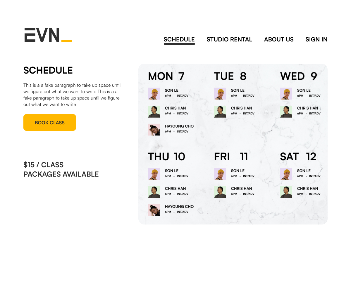
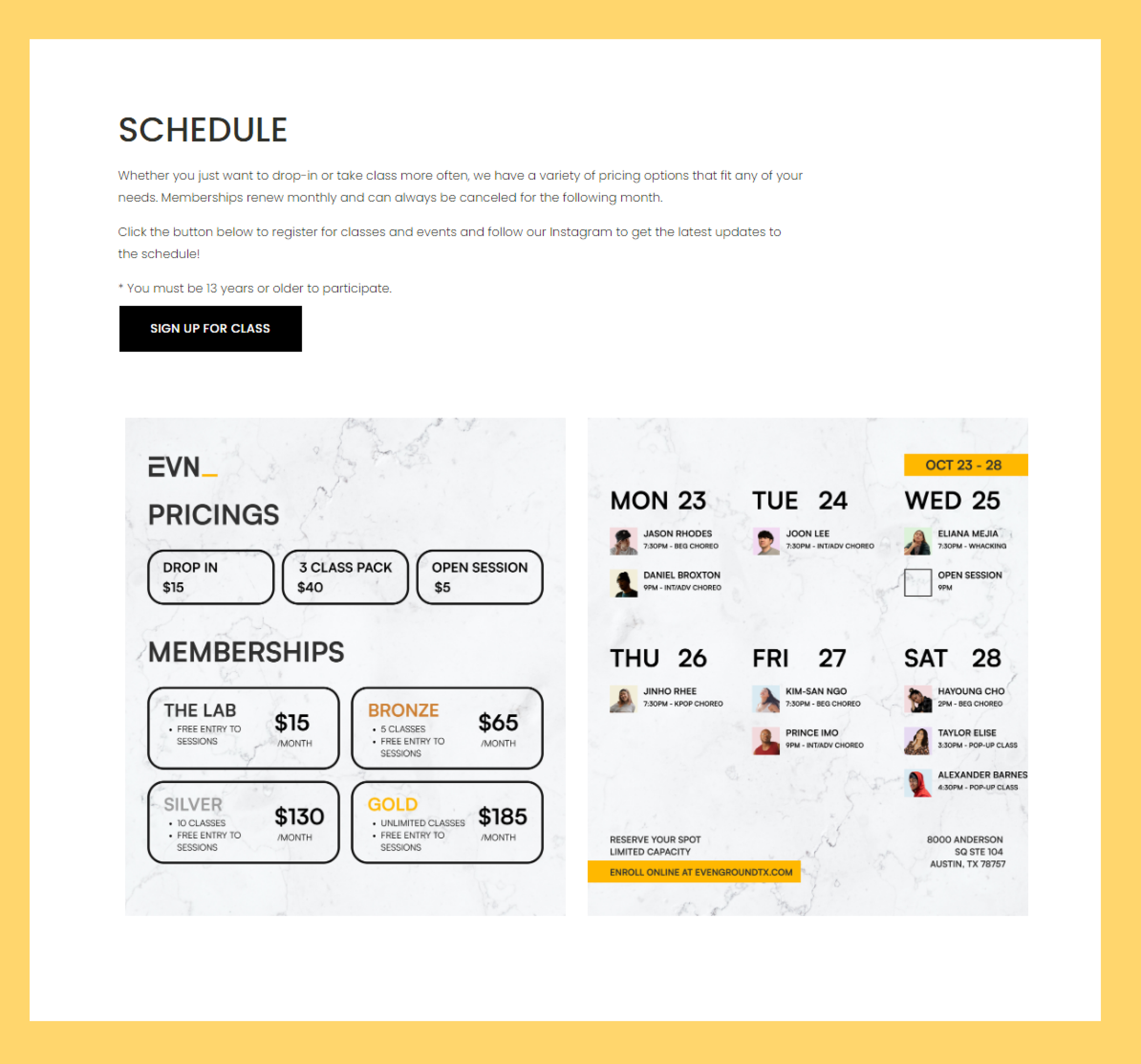
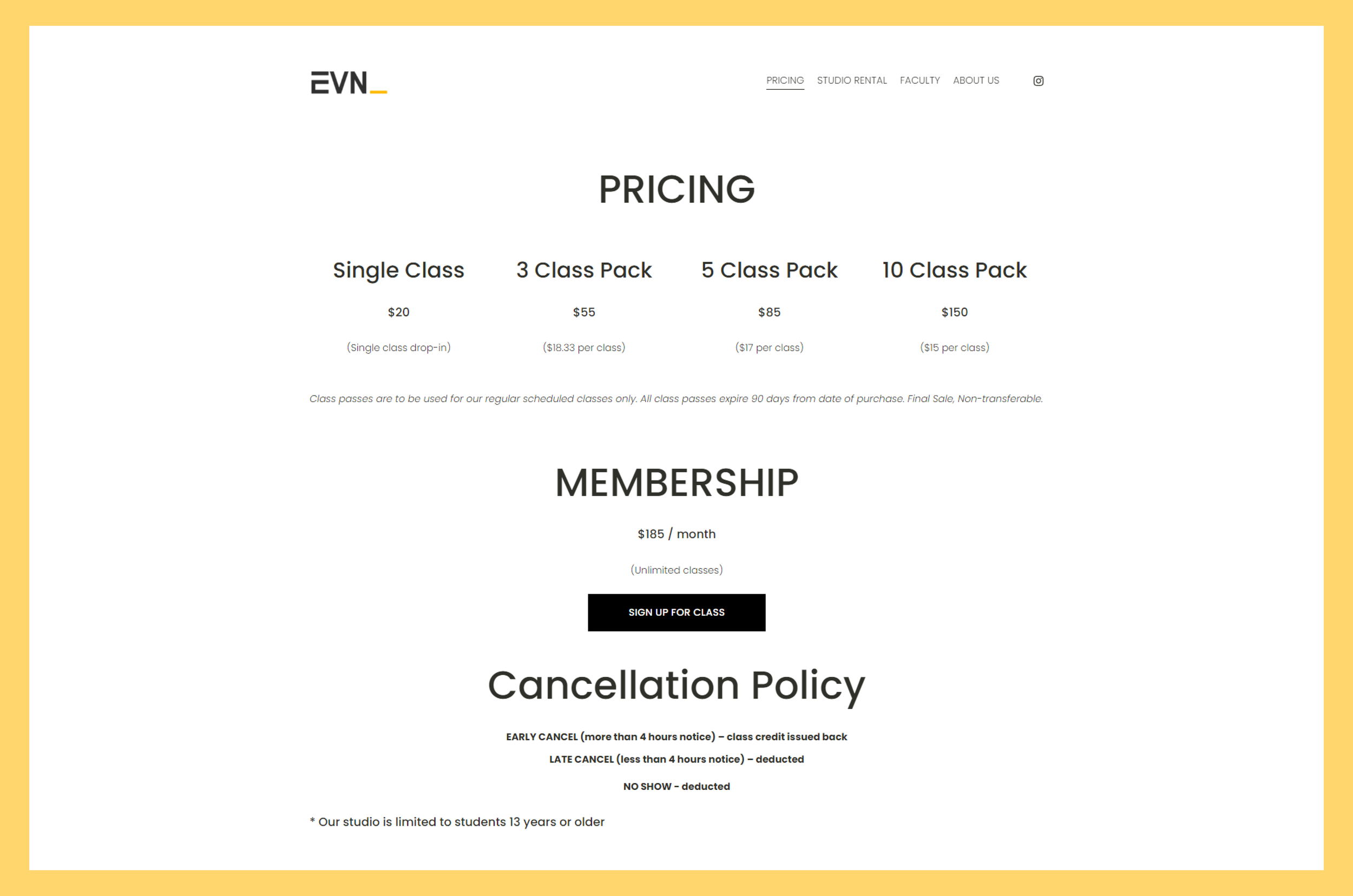
Originally I had a SCHEDULE page that included a graphic of the weekly and naturally the respective pricing for those classes. However, after some feedback, I decided to fully change the page to PRICING and fully commit to displaying all the different class pack options.
Because of limitations on Squarespace in terms of effectively functioning as a medium to both buy class packs, view the calendar, and enroll in specific classes, we opted to have our CTA button lead to a more effective 3rd party website called Pike13, a dedicated scheduling and client management software, which would create a better user experience.
Prior Schedule Page
New and updated Pricing page
Takeaways
According to professional analyses, a good bounce rate is somewhere under or around 50%. My website design therefore has positive impact as we float at 50.94%.
Reasons as to why the bounce rate would be higher is because the CTA and services offered are already showcased on the main page, leading them to exit our website and go straight to our booking service.
After launching our website when our business opened, I believe my design helped accomplish the business and user goals I had set initially. We’ve gained 600 unique clients and 2000+ followers impressions in 3 months. We’ve had sold-out events and high engagement from attendees.
Our website is minimal and to the point, unlike our competitors whose websites have very packed sitemaps, too many pages, and visual overload, and it feels easy to get lost and hard to find the CTA.
Due to budget, there were website limitations in terms of UI element placement, limited fonts, alignment, and spacing. Therefore we used Squarespace which is why we integrated Pike13 as our 3rd party booking service to ensure a smooth user experience.
What I learned from this experience is adaptation. Whatever I drafted had to be adjusted with what I was given in terms of actual implementation and marketing practices.
New and updated Pricing page
